
Overview:
The poster promotes scheduling an eye exam.
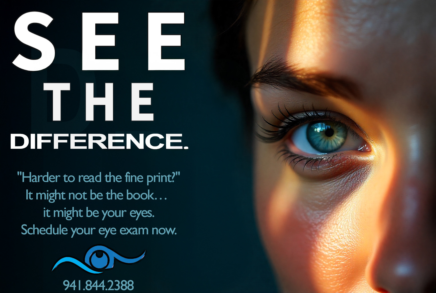
It features a close-up photo of a blue-green eye on the right side.
The left side contains bold and clear text.
Concept:
Emphasizes the idea of “seeing the difference” in vision.
Suggests that if someone is having trouble reading fine print, it might be due to their eyes rather than the book. Encourages action to schedule an eye exam.
Design Features:
Large, bold text at the top: "SEE THE DIFFERENCE."
A smaller font underneath with the message:
"Harder to read the fine print?" It might not be the book… it might be your eyes. Schedule your eye exam now.
"Harder to read the fine print?" It might not be the book… it might be your eyes. Schedule your eye exam now.
Eye-related logo beneath the text, incorporating an eye symbol with a wave design.
Phone number (941.844.2388) clearly displayed for easy contact.
Dark background with bright lighting focused on the eye to draw attention.
White and light blue text colors for good contrast and readability.
Execution:
The visual focus on the eye aligns with the message about vision.
The use of clean, modern fonts enhances clarity.
Balanced layout between image and text for effective communication.
Strong call to action through the phone number and scheduling prompt.